GrocerEase
GrocerEase is a grocery delivery startup focused on helping seniors shop online without relying on family or caretakers. They approached us to redesign their mobile app after receiving multiple complaints from older users who found the app too complex. Our goal was to create a digital experience that was intuitive, accessible, and empowering for users over 60.
Problem
Elderly users were abandoning the app mid-task due to small touch targets, confusing flow, and text-heavy interfaces. Most couldn’t complete an order without external help. The client needed an interface that prioritized accessibility without feeling “dumbed down.”
Solution
We began by conducting usability interviews with 10 elderly users and auditing the existing UX. From there, we redesigned the entire flow with accessibility principles in mind:
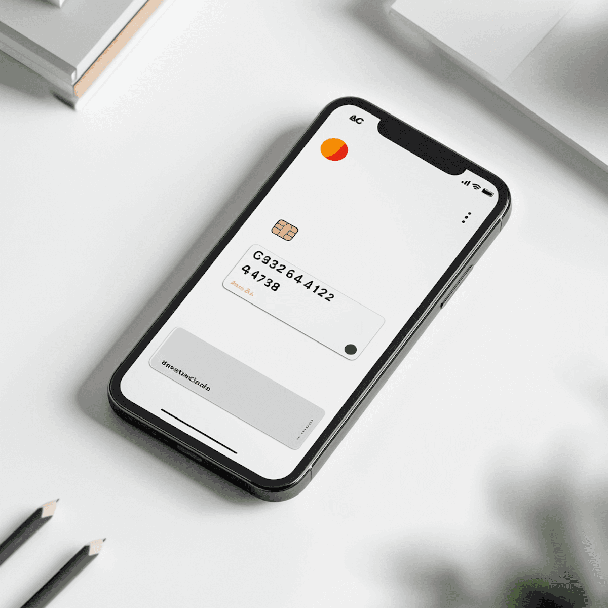
Larger buttons and text sizes with high-contrast color schemes.
Voice-assisted search and checkout powered by natural language prompts.
A simplified, 3-step order process with progress indicators.
A “Reorder Essentials” feature for one-tap shopping of recurring items.
Added human support CTA on every screen for peace of mind.
Overview
GrocerEase is a growing grocery delivery startup targeting underserved user segments. After expanding into suburban and semi-urban communities in Nigeria, the team noticed a growing user base of elderly individuals (aged 60+) who were signing up but abandoning carts or never placing orders. The product team reached out to redesign the mobile app experience, making it more accessible and intuitive for older adults.
Research & Discovery
Kickoff Goal:
Understand the barriers elderly users face while using the GrocerEase mobile app and redesign the experience to better serve them, without alienating the younger demographic.

Methods Used:
Contextual inquiry (we observed how older adults used the app in real settings, with caregivers or solo)
Semi-structured user interviews (6 participants, aged 62–78)
Customer support logs (analyzed ~200 help tickets tagged under "difficulty placing order")
Heuristic evaluation of the current UI (Nielsen's principles)
Key Findings:
Cognitive Load: Users found the interface “crowded,” with too many options on one screen. Menus and filters were labeled in tech jargon (“Apply Coupon,” “Multi-list Checkout”) that was unfamiliar.
Touch Targets: Many users had difficulty with small buttons and close grouping of elements.
Navigation Confusion: The tab bar was not intuitive. Some users couldn’t differentiate between “Home,” “Categories,” and “Explore.”
Error Recovery: Accidental taps during checkout caused users to abandon the process entirely, as they didn’t know how to go back.
Lack of Trust: Users hesitated to enter card details or addresses because they weren’t sure if their order went through or if the system was “safe.”
UX Approach
Problem Framing:
Our primary problem wasn’t just UI—it was confidence. Older users needed clarity, simplicity, and assurance at every step. We focused on minimizing steps, removing uncertainty, and giving constant visual feedback.
Personas Created:
Mama Rose, 71, lives alone in Asaba. Relies on the app to buy essentials weekly.
Baba Idris, 67, tech-curious but needs help with anything beyond WhatsApp.
Ideation & Wireframing
Design Goals:
Reduce cognitive friction by prioritizing essential actions
Increase legibility and touch accessibility
Build user trust through feedback and predictability
Key UX Changes:
Simplified Navigation: Merged “Explore” and “Categories” into one home view. Reduced tabs to three: Home, Cart, Orders.
Bigger Touch Targets: All tappable elements increased to a minimum of 48px, following WCAG 2.1 guidelines.
One-Tap Reordering: Added “Your Weekly List” based on previous orders, allowing for repeat orders in one tap.
Assisted Voice Search: Integrated voice input using Web Speech API, enabling users to say “Add milk and bread” instead of typing.
Progressive Checkout: Broke the payment process into three clear steps with visual confirmation after each one.
Trust Indicators: Added “Your payment is secured” badges, short animations after checkout, and an option to pay on delivery.
Tools Used:
Wireframes and low-fidelity mockups in Figma
Interactive prototypes tested with Maze
Accessibility tested with Stark Plugin
Testing & Iteration
We conducted two rounds of usability testing with 6 elderly users in round one, and 5 in round two. Key observations and fixes:
Issue: One user kept tapping “back” during checkout thinking it would undo a choice
→ Fix: Added inline edit buttons to every step, reducing the need for back navigation.Issue: Users hesitated at the payment screen, unsure if it was final
→ Fix: Included a step label: Step 3 of 3: Confirm & Pay.
Post-test metrics:
Task success rate improved from 36% → 88%
Time to complete order dropped by 42%
Satisfaction score averaged 4.6/5 from previously frustrated users
Outcome
Order completion rate among 60+ users improved by 40%
Customer support tickets related to checkout dropped by 58%
GrocerEase received positive reviews on senior-focused blogs and forums
The client is now considering expanding this redesign into a “Senior Mode” toggle for all users

